
Using Color Theory to Solve Common Design Dilemmas
Introduction
Color plays a crucial role in design, as it has the power to evoke emotions, convey messages, and create visual harmony. However, choosing the right colors for a design project can often be a challenging task. Whether you’re a professional designer or someone who wants to enhance their visual creations, understanding color theory can help you overcome common design dilemmas and create visually appealing compositions.
1. Understanding the Basics of Color Theory
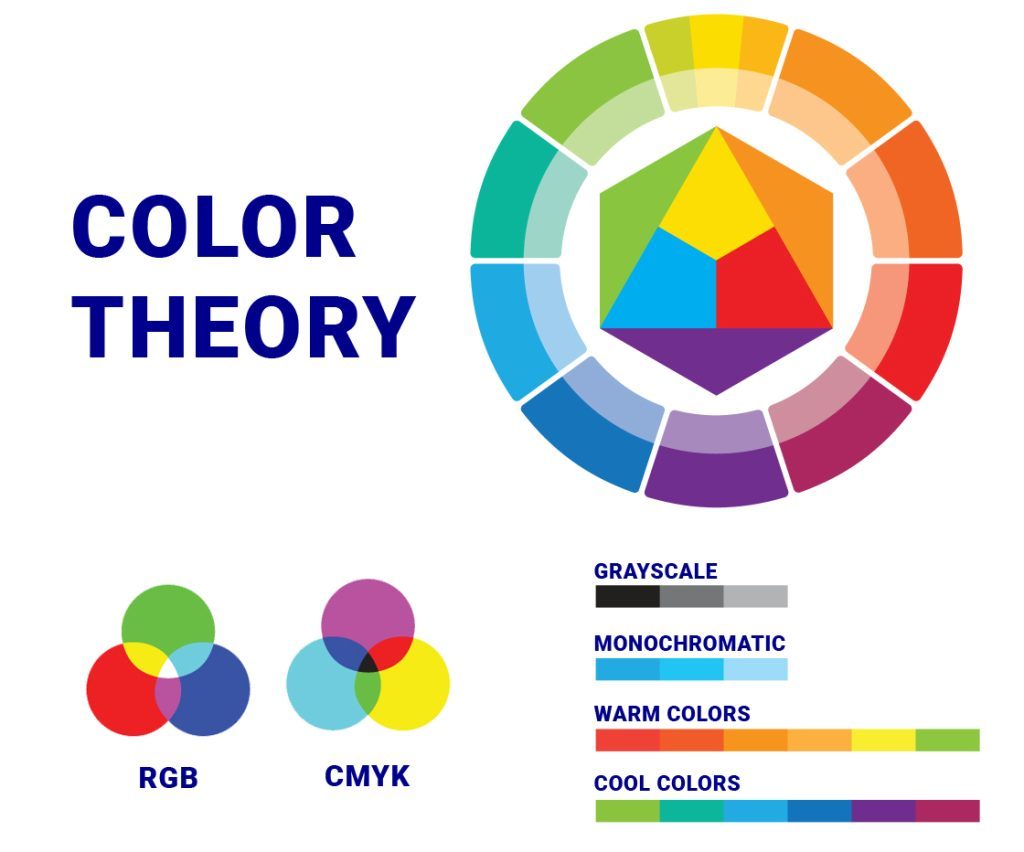
Before diving into solving design dilemmas, it’s essential to grasp the fundamentals of color theory. Familiarize yourself with the color wheel, primary, secondary, and tertiary colors, as well as concepts like hue, saturation, and value.
2. Creating Harmony with Complementary Colors
One common design dilemma is achieving harmony between different elements. Complementary colors, located opposite each other on the color wheel, can help you strike a balance. Pairing warm and cool colors or using their shades and tints can create a visually pleasing composition.
2.1 Using Complementary Colors in Typography
When working with text, consider using complementary colors to enhance readability and make important information stand out. For example, pairing a blue headline with an orange subheading can create a visually appealing contrast.
3. Balancing Contrast with Analogous Colors
Another design challenge is finding the right balance of contrast. Analogous colors, which are adjacent on the color wheel, can help you achieve this. By selecting colors from the same family, you can create a harmonious design while maintaining enough contrast to make elements distinguishable.
3.1 Enhancing Depth with Analogous Colors
Using analogous colors in a gradient or shading technique can add depth and dimension to your design. This technique is particularly effective in creating realistic illustrations or giving a three-dimensional feel to flat designs.
4. Setting the Right Mood with Color Psychology
Colors have the power to evoke specific emotions and set the mood of a design. Understanding color psychology can help you convey the desired message and create a meaningful connection with your audience.
Summary
In this blog post, we will explore how color theory can be used to solve common design dilemmas. We will delve into the basics of color theory, including the color wheel, color harmonies, and the psychological effects of different colors. By understanding these concepts, you will be able to make informed decisions when it comes to color selection in your designs.
We will also discuss how to create balance and contrast using color, as well as how to effectively use color to highlight important elements and create focal points. Additionally, we will provide practical tips and techniques for choosing color palettes that work well together and evoke the desired emotions or messages.
Whether you’re struggling with choosing the right colors for a website, logo, or any other design project, this blog post will provide you with valuable insights and strategies to overcome common design dilemmas. By apply look at here now ing color theory principles, you can take your designs to the next level and create visually stunning compositions that captivate your audience.
- Q: How can color theory help solve common design dilemmas?
- A: Color theory provides guidelines and principles that can help designers make informed decisions about color combinations, contrast, and harmony, ultimately resolving design dilemmas.
- Q: What is color harmony?
- A: Color harmony refers to the pleasing arrangement of colors in a design. It involves selecting colors that work well together and create a sense of balance and unity.
- Q: How can I create contrast in my design?
- A: To create contrast, you can use colors that are opposite on the color wheel (complementary colors), or colors with a significant difference in lightness and darkness (high contrast). This helps elements stand out and adds visual interest.
- Q: What are warm and cool colors?
- A: Warm colors (such as red, orange, and yellow) evoke feelings of warmth, energy, and excitement. Cool colors (such as blue, green, and purple) create a sense of calmness, tranquility, and relaxation.
- Q: How can I use color to convey emotions or messages?
- A: Different colors can evoke specific emotions or convey messages. For example, red can symbolize passion or danger, while blue can represent trust or serenity. Understanding color psychology can help you effectively communicate through your design.
- Q: What is the importance of color consistency in branding?
- A: Color consistency is crucial in branding as it helps establish recognition and build brand identity. Consistently using specific colors across various platforms and materials creates a cohesive and memorable brand image.

Hello, I’m Luca Cornwall, a passionate and experienced Graphic Designer specializing in various aspects of design, including banner and poster design, web design principles, typography insights, and color theory. With a keen eye for detail and a strong creative vision, I strive to create visually stunning and impactful designs that effectively communicate messages and captivate audiences.