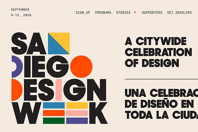
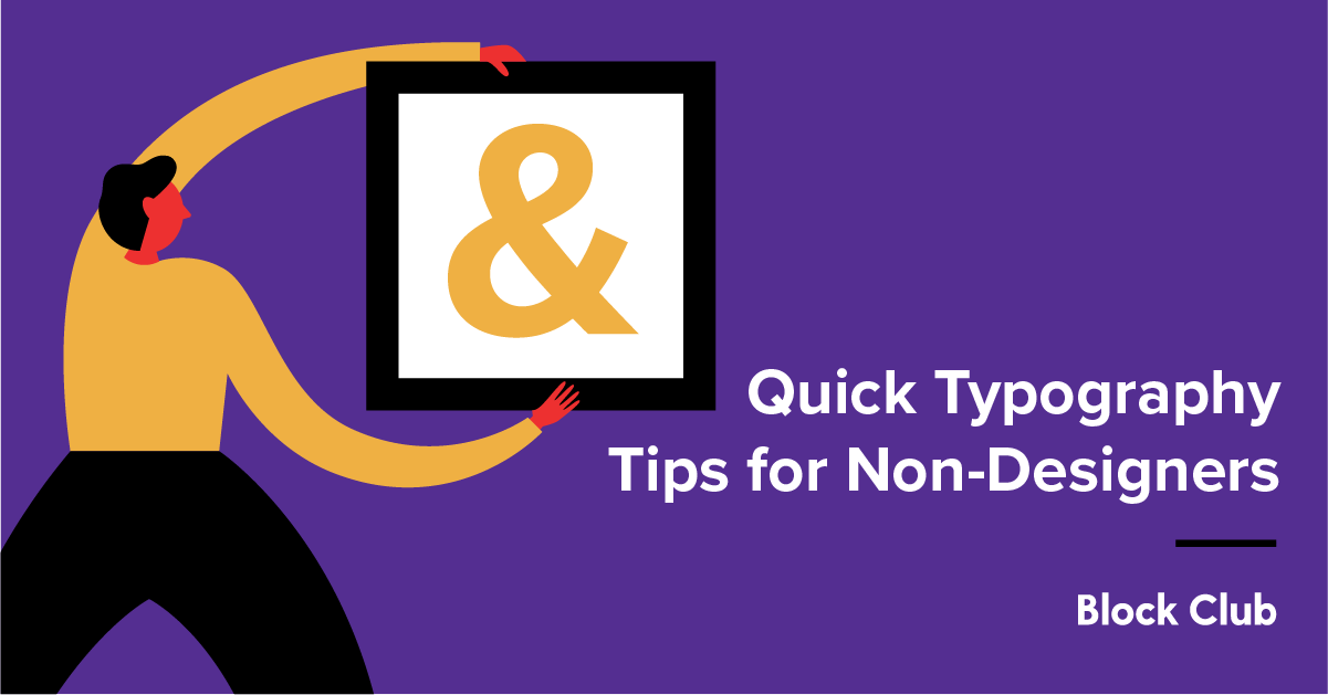
Exploring the World of Variable Fonts in Design

Introduction

Variable fonts have revolutionized the world of design by providing unprecedented flexibility and control over typography. With the ability to adjust various attributes of a font, such as weight, width, and slant, variable fonts offer endless possibilities for creative expression. In this blog post, we will delve into the fascinating world of variable fonts, exploring their benefits, applications, and how they are transforming the design landscape.

What are Variable Fonts?

Variable fonts are a revolutionary development in the world of typography. Unlike traditional fonts that come in fixed styles and weights, variable fonts offer a wide range of design possibilities by allowing users to adjust various attributes such as weight, width, slant, and more.

The Advantages of Variable Fonts

Variable fonts bring numerous advantages to designers and developers:

1. Greater Flexibility

With variable fonts, designers have the freedom to fine-tune typography to fit their specific needs. They can easily adjust the weight, width, and other attributes to create unique and customized designs.

2. Improved Performance

Variable fonts are highly efficient as they require less file size compared to traditional fonts. This results in faster loading times and improved website performance.

3. Enhanced Responsiveness

Variable fonts are responsive by nature. They can adapt to different screen sizes and resolutions, ensuring optimal legibility and readability across various devices.

4. Simplified Workflow

Using variable fonts eliminates the need to manage multiple font files for different styles and weights. This simplifies the design process and reduces the chances of errors.

How to Use Variable Fonts

Integrating variable fonts into your design workflow is relatively straightforward:

1. Choose the Right Variable Font

There are numerous variable fonts available, each with its own unique characteristics. Select a font that aligns with your design goals and complements your brand identity.

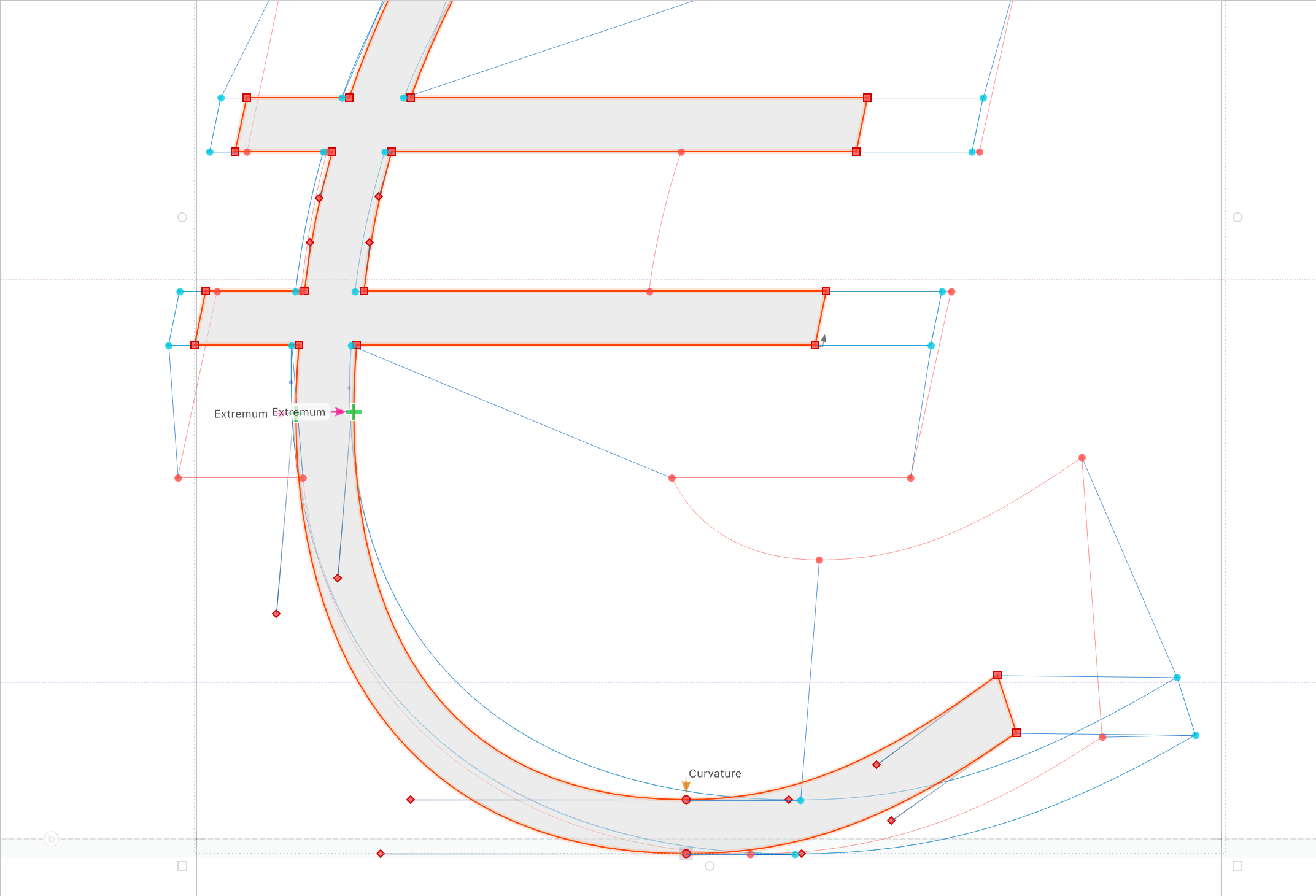
2. Understand the Font Axes

Variable fonts consist of various axes that control different attributes. Familiarize yourself with these axes to effectively manipulate the font and achieve the desired design outcome.

3. Experiment and Iterate

Variable fonts offer endless possibilities for experimentation. Play around with different settings and combinations to find the perfect balance that enhances your design.

4. Test Across Devices

Image

Ensure that your variable font renders correctly on different devices and browsers. Test its performance and legibility to guarantee a consistent user experience.

Summary

Variable fonts are a groundbreaking development in typography that allows designers to manipulate multiple aspects of a font’s appearance. Unlike traditional fonts that come in fixed styles, such as regular, bold, or italic, variable fonts offer a wide range of possibilities within a single font file. This flexibility enables designers to fine-tune typography to suit specific design needs, resulting in more cohesive and visually appealing compositions.

One of the key advantages of variable fonts is their ability to optimize web performance. By consolidating multiple font files into a single variable font file, websites can load faster and reduce bandwidth usage. This is particularly beneficial for responsive design, where fonts can be adjusted dynamically based on screen size and device capabilities.

Variable fonts also empower designers to experiment with typography in ways that were previously unimaginable. With the ability to adjust weight, width, slant, and other attributes on a continuous spectrum, designers can create unique and customized typographic treatments that perfectly complement their design vision. This level of control allows for greater consistency across different platforms and devices, ensuring a seamless user experience.

Furthermore, variable fonts offer improved accessibility by providing more options for legibility and readability. Designers can fine-tune font attributes to enhance readability for individuals with visual impairments or to optimize legibility on different screen sizes and resolutions. This inclusivity ensures that content is accessible to a wider audience, regardless of their device or visual capabilities.

In conclusion, variable fonts have opened up a world of possibilities for designers, offering greater control, flexibility, and creativity in typography. With their ability to optimize web performance, enhance accessibility, and enable unique typographic treatments, variable fonts are transforming the design landscape. As designers continue to explore and experiment with this innovative technology, we can expect to go to my blog see even more exciting.

Q: What are variable fonts?
A: Variable fonts are a new type of font format that allows for multiple variations within a single font file. They offer greater flexibility and control over typography, enabling designers to adjust attributes such as weight, width, and slant.
Q: How do variable fonts differ from traditional fonts?
A: Unlike traditional fonts, variable fonts contain a range of design variations within a single file. This means that instead of having separate font files for each weight or style, designers can now access a wide spectrum of possibilities using just one file.
Q: What are the benefits of using variable fonts?
A: Variable fonts offer several advantages, including smaller file sizes, improved performance, and greater design flexibility. They allow for seamless transitions between font styles, making it easier to create responsive designs and customize typography to fit specific needs.
Q: How can variable fonts enhance web design?
A: Variable fonts can greatly enhance web design by providing more creative freedom and reducing the need for multiple font files. They enable designers to optimize typography for different screen sizes and resolutions, resulting in a more consistent and visually appealing user experience.
Q: Are variable fonts supported by all browsers?
A: While variable fonts are gaining wider support, not all browsers fully support them yet. However, major browsers such as Chrome, Firefox, Safari, and Edge have started to adopt variable font technology, making it increasingly accessible for web designers.
Q: How can I start using variable fonts in my design projects?
A: To start using variable fonts, you need to ensure that the font you want to use is available in a variable format. Once you have the font file, you can include it in your CSS using the @font-face rule and specify the desired variations using font-variation-settings or font-weight and font-stretch properties.

Hand Lettering vs. Digital Fonts: Pros and Cons

Introduction

Hand lettering and digital fonts are two popular methods of creating visually appealing typography. While hand lettering involves the art of drawing letters by hand, digital fonts are pre-designed typefaces that can be easily used on computers and other digital devices. Both techniques have their own unique advantages and disadvantages, and in this blog post, we will explore the pros and cons of each.

Pros of Hand Lettering

1. Unique and Personalized

Hand lettering allows for complete creative freedom, resulting in unique and personalized designs. Each letter can be customized to fit the desired style, making it perfect for creating one-of-a-kind artwork or branding materials.

2. Authentic and Artistic

Hand lettering adds a touch of authenticity and artistry to any project. The imperfections and subtle variations in each stroke give the design a human touch, making it visually appealing and engaging.

3. Versatility

Hand lettering can be done on various surfaces, including paper, chalkboards, walls, and even digital platforms. This versatility allows artists to experiment with different mediums and create stunning designs for a wide range of purposes.

4. Therapeutic and Relaxing

Engaging in hand lettering can be a therapeutic and relaxing activity. The process of drawing each letter requires focus and attention to detail, which can help reduce stress and promote mindfulness.

5. Tangible and Traditional

Hand lettering provides a tangible and traditional experience. The physical act of holding a pen or brush and creating letters on paper can be nostalgic and satisfying, especially in a digital age where everything is often done on screens.

Cons of Hand Lettering

1. Time-consuming

Hand lettering is a time-consuming process, especially for intricate designs or longer texts. Each letter needs to be carefully crafted, which can be a drawback when working on tight deadlines or large-scale projects.

2. Limited Reproducibility

Hand lettering designs are difficult to reproduce exactly. Even with the use of guidelines or stencils, there will always be slight variations.

Summary

Hand lettering offers a personal touch and allows for more creativity and customization. It can convey a sense of authenticity and uniqueness that digital fonts often lack. However, hand lettering requires time, skill, and practice to master, making it a more time-consuming and labor-intensive process.

On the other hand, digital fonts provide convenience and efficiency. They offer a wide range of options and can be easily scaled, manipulated, and reproduced. Digital fonts are readily available and can be used across various platforms and devices. However, they may lack the organic and artistic qualities that hand lettering possesses.

Ultimately, the choice between hand lettering and digital fonts depends on the specific project requirements, personal anonymous preferences, and the desired aesthetic. Both techniques have their own merits and can be used effectively to create visually stunning typography.

Expressing Brand Personality Through Typography

Introduction

Typography plays a crucial role in expressing a brand’s personality and creating a lasting impression on its audience. It goes beyond just selecting a font; it encompasses the overall visual representation of a brand’s identity. The right typography can evoke emotions, convey messages, and establish a unique brand voice. In this blog post, we will explore the significance of typography in expressing brand personality and how it can be effectively utilized to create a strong brand identity.

1. Understanding Brand Personality

Before diving into typography, it is essential to understand the concept of brand personality. Brand personality refers to the human characteristics associated with a brand. It helps in creating a unique identity and connecting with the target audience on a deeper level.

1.1 Defining brand personality traits

Identify the key traits that define your brand’s personality. Is it playful, sophisticated, or trustworthy? Understanding these traits will guide your typography choices.

1.2 Aligning typography with brand personality

Choose fonts that align with your brand’s personality traits. For example, a luxury brand may opt for elegant and refined typefaces, while a youthful brand may prefer bold and playful fonts.

2. Selecting the Right Typeface

The typeface you choose sets the tone for your brand. It should reflect your brand’s personality and resonate with your target audience. Here are some factors to consider when selecting a typeface:

2.1 Serif vs. Sans-serif

Serif typefaces, with their decorative strokes, convey a sense of tradition and elegance. On the other hand, sans-serif typefaces are more modern and minimalistic. Choose the one that aligns with your brand’s personality.

2.2 Font weight and style

The weight and style of a font can greatly impact how your brand is perceived. Bold and heavy fonts exude strength and confidence, while light and thin fonts convey delicacy and sophistication.

2.3 Legibility and readability

Ensure that the chosen typeface is legible and readable across different mediums and sizes. It should be easily comprehensible to your target audience.

Summary

Typography is a powerful tool for expressing a brand’s personality. It involves selecting the right fonts, styles, and layouts to create a visual representation that aligns with the brand’s values and resonates with its target audience. By carefully choosing typography elements, a brand can convey its unique voice, evoke specific emotions, and differentiate itself from competitors.

When selecting fonts, it is essential to consider their characteristics and how they align with the brand’s personality traits. For example, a bold and modern font may be suitable for a tech startup, while a classic and elegant font may be more appropriate for a luxury brand.

Typography also extends to other design elements such as spacing, alignment, and hierarchy. Consistency in these aspects helps establish a cohesive brand identity and enhances readability. Additionally, the use of typography in logos, packaging, and marketing materials further reinforces the brand’s personality and creates a memorable visual identity.

In conclusion, typography is a powerful tool for expressing brand personality and creating a strong brand identity. By carefully selecting fonts, styles, and layouts, a brand can convey its unique voice, evoke emotions, and differentiate itself from competitors. Investing time and effort into typography can significantly impact how a brand is perceived and rem straight from the source embered by its audience.

Q: What is brand personality?
A: Brand personality refers to the human characteristics and traits associated with a brand. It helps create a unique identity and emotional connection with the target audience.
Q: How can typography express brand personality?
A: Typography plays a crucial role in expressing brand personality as different fonts, styles, and sizes evoke different emotions and perceptions. It helps convey the brand’s tone, values, and overall image.
Q: What factors should be considered when choosing typography for brand personality?
A: Factors such as font style, weight, spacing, and color should be considered. The typography should align with the brand’s values, target audience, and overall brand identity.
Q: How can typography evoke specific emotions?
A: Typography can evoke emotions through various means. For example, bold and strong fonts can convey confidence and power, while cursive or script fonts can evoke elegance and sophistication.
Q: Can typography alone express brand personality?
A: While typography is an essential element, it is not the sole factor in expressing brand personality. Other design elements, such as colors, imagery, and messaging, also contribute to creating a cohesive brand identity.

The Impact of Typography on User Readability

Introduction

Typography plays a crucial role in enhancing user readability and overall user experience on websites and other digital platforms. The choice of fonts, font sizes, spacing, and other typographic elements can significantly impact how users perceive and interact with the content. In this blog post, we will explore the importance of typography in improving user readability and discuss some best practices to ensure optimal typographic choices for better user engagement.

1. The Importance of Typography in Web Design

Typography plays a crucial role in web design as it directly impacts user readability. The choice of fonts, sizes, spacing, and other typographic elements greatly influences how users perceive and interact with the content on a website.

2. Font Selection

Choosing the right font is essential for enhancing user readability. Fonts should be legible and easy on the eyes. Sans-serif fonts like Arial and Helvetica are commonly used for online content due to their clean and modern appearance. Serif fonts like Times New Roman are more suitable for print materials.

2.1 Font Size

The size of the font also affects readability. It is important to strike a balance between font size and readability. Too small, and users may strain their eyes, while too large can disrupt the flow of the content. Generally, a font size of 16 pixels or above is recommended for optimal readability.

2.2 Font Weight

Font weight refers to the thickness or heaviness of the characters. Using different font weights can help create visual hierarchy and guide users through the content. Bolder fonts can be used for headings and subheadings, while lighter weights are suitable for body text.

3. Line Length and Spacing

The length of the lines and the spacing between them significantly impact readability. Long lines of text can be overwhelming and difficult to follow, while short lines can disrupt the reading flow. Ideally, the line length should be around 50-75 characters per line. Additionally, proper line spacing, also known as leading, ensures that the text is comfortably readable without feeling cramped.

4. Contrast and Color

Contrast between the text and the background is crucial for readability. High contrast ensures that the text stands out and is easily distinguishable. Black text on a white background is a classic example of high contrast. Additionally, color can be used to emphasize important elements such as headings or links, but it should be used sparingly to avoid overwhelming the user.

4.1 Accessibility Considerations

When choosing colors, it is important to consider accessibility for users with visual impairments.

Summary

Typography has a profound impact on user readability, which directly affects how users consume and understand the content presented to them. When typography is carefully considered and implemented, it can greatly enhance the overall user experience and engagement on a website or any other digital platform.

Choosing the right fonts is crucial as different typefaces have varying levels of readability. Sans-serif fonts like Arial or Helvetica are often preferred for digital content due to their clean and modern appearance. Serif fonts like Times New Roman or Georgia are commonly used for print materials as they provide a more traditional and formal feel.

Font size is another critical factor in typography. It is essential to select an appropriate font size that ensures comfortable reading without straining the user’s eyes. Too small or too large font sizes can negatively impact readability and user experience.

Proper spacing between letters, words, and lines is also essential for optimal readability. Adequate line spacing, known as leading, prevents text from appearing cramped and improves legibility. Additionally, appropriate letter and word spacing contribute to the overall readability and comprehension of the content.

Furthermore, the use of hierarchy and emphasis through typographic elements such as headings, subheadings, bold or italicized text, and color can guide users through the content and highlight important information. Consistency in typography across a website or platform also helps users navigate and understand the content more efficiently.

In conclusion, typography significantly impacts user readability and overall user experience. By carefully selecting fonts, font sizes, spacing, and utilizing typographic hierarchy, check my source designers can create visually appealing and easily readable content that engages users and enhances their interaction with the digital platform.

Q: What is typography?
A: Typography refers to the style, arrangement, and appearance of text. It involves selecting fonts, sizes, spacing, and other design elements to enhance readability and visual appeal.
Q: How does typography impact user readability?
A: Typography plays a crucial role in user readability. Proper font choice, size, and spacing can make text easier to read, while poor typography can strain the eyes and make content less accessible.
Q: What are some key factors to consider for optimal typography?
A: Key factors for optimal typography include selecting legible fonts, using appropriate font sizes, maintaining proper line spacing, ensuring sufficient contrast between text and background, and avoiding excessive use of decorative fonts.
Q: How does font choice affect readability?
A: Font choice significantly impacts readability. Sans-serif fonts like Arial or Helvetica are generally easier to read on screens, while serif fonts like Times New Roman or Georgia are more suitable for print. It’s important to choose fonts that are clear, well-spaced, and don’t strain the eyes.
Q: Why is font size important for user readability?
A: Font size directly affects readability. Text that is too small can be difficult to read, especially for users with visual impairments or when viewing content on small screens. It’s recommended to use a font size of at least 16 pixels for body text.
Q: How does line spacing impact readability?
A: Proper line spacing, also known as leading, improves readability by providing enough space between lines. Insufficient line spacing can make text appear cramped and difficult to read, while excessive spacing can disrupt the flow. A line spacing of 1.5 to 2 times the font size is generally recommended.
Q: Why is contrast important in typography?
A: Contrast between text and background is crucial for readability, especially for users with visual impairments. Insufficient contrast can make text hard to distinguish, while excessive contrast can cause eye strain. It’s important to ensure a clear contrast between text and background colors.
Q: What should be avoided in typography for better readability?</dt

Typography Trends That Are Shaping Modern Design

Introduction

Typography plays a crucial role in modern design, as it has the power to enhance the visual appeal and convey the intended message effectively. With the ever-evolving design landscape, typography trends continue to shape the way we perceive and interact with various forms of media. In this blog post, we will explore some of the latest typography trends that are revolutionizing modern design.

2. Minimalist Typography

Minimalism has become a popular design approach, and typography is no exception. Minimalist typography focuses on simplicity, using clean and straightforward fonts with ample white space. This trend emphasizes legibility and clarity, allowing the content to take center stage without distractions.

3. Bold and Oversized Fonts

In contrast to minimalist typography, bold and oversized fonts make a statement. This trend involves using large, attention-grabbing fonts to create visual impact. Bold typography can be used for headlines, titles, or important messages, instantly capturing the viewer’s attention and conveying a strong message.

4. Custom Handwritten Fonts

Custom handwritten fonts add a personal touch to modern design. These unique and authentic fonts create a sense of warmth and individuality. Handwritten typography can be used to evoke emotions, establish a brand identity, or add a personal element to digital content.

5. Experimental Typography

Experimenting with typography allows designers to push boundaries and create innovative designs. This trend involves playing with unconventional fonts, layouts, and arrangements to create visually striking compositions. Experimental typography can be used to convey abstract concepts, challenge traditional design norms, or create a sense of intrigue.

6. Geometric Fonts

Geometric fonts are characterized by clean lines, sharp angles, and symmetrical shapes. This trend embraces simplicity and precision, often used in modern and futuristic designs. Geometric typography can add a contemporary and sophisticated touch to various design projects, from websites to branding materials.

7. Retro and Vintage Typography

Retro and vintage typography has made a comeback in modern design. This trend draws inspiration from past eras, using fonts that evoke nostalgia and a sense of history. Retro typography can be used to create a vintage aesthetic, add personality to designs.

Summary

Image

Typography trends are constantly evolving, and staying up-to-date with the latest styles and techniques is essential for designers. Here is a summary of some typography trends that are shaping modern design:

  • 1. Minimalistic Typography: Clean and simple fonts are gaining popularity, allowing the content to take center stage.
  • 2. Bold and Vibrant Fonts: Eye-catching and expressive fonts are being used to create impactful designs.
  • 3. Custom Typography: Designers are increasingly creating unique and personalized fonts to add a distinctive touch to their projects.
  • 4. Variable Fonts: These versatile fonts allow for greater flexibility in adjusting weight, width, and other attributes.
  • 5. Overlapping Text: Overlapping letters or words can create visually interesting compositions and add depth to the design.
  • 6. Handwritten Fonts: The use of handwritten or script fonts adds a personal and authentic feel to designs.
  • 7. Experimental Typography: Designers are pushing boundaries by experimenting with unconventional layouts, distortions, and effects.

By em he has a good point bracing these typography trends, designers can create visually captivating and engaging designs that leave a lasting impression on their audience.

Q: What are some popular typography trends in modern design?
A: Some popular typography trends in modern design include minimalist typography, bold and oversized fonts, custom and hand-drawn typefaces, and the use of negative space.
Q: How can minimalist typography enhance modern design?
A: Minimalist typography can enhance modern design by creating a clean and elegant look, improving readability, and allowing other design elements to stand out.
Q: Why are bold and oversized fonts trending in modern design?
A: Bold and oversized fonts are trending in modern design because they grab attention, add visual impact, and create a strong focal point in a design composition.
Q: What is the significance of custom and hand-drawn typefaces in modern design?
A: Custom and hand-drawn typefaces add uniqueness, personality, and a human touch to modern design, making it stand out from generic and widely-used fonts.
Q: How does the use of negative space contribute to modern typography trends?
A: The use of negative space in typography trends helps create a sense of balance, elegance, and sophistication in modern design, allowing the text to breathe and stand out.

The Art of Pairing Fonts: Creating Harmonious Typography

Introduction

Typography plays a crucial role in design, and choosing the right fonts can greatly enhance the visual appeal and readability of any project. However, selecting fonts that work well together can be a daunting task. In this blog post, we will explore the art of pairing fonts and provide you with valuable tips and techniques to create harmonious typography that captivates your audience.

1. Understanding Font Categories

Before diving into font pairing, it’s essential to understand different font categories. Fonts can be broadly classified into four categories: serif, sans-serif, script, and display. Serif fonts have small decorative lines at the ends of characters, while sans-serif fonts lack these lines. Script fonts mimic handwriting, and display fonts are decorative and attention-grabbing.

2. Contrast is Key

When pairing fonts, contrast is crucial for creating visual interest and ensuring readability. Combining fonts from different categories, such as pairing a serif font with a sans-serif font, creates a pleasing contrast. This contrast helps distinguish different elements and adds depth to the typography.

2.1 Serif and Sans-Serif Combination

A classic pairing is combining a serif font with a sans-serif font. This combination offers a balance between elegance and modernity. For example, pairing a serif font like Times New Roman with a sans-serif font like Arial creates a harmonious blend of traditional and contemporary styles.

2.2 Script and Sans-Serif Combination

Pairing a script font with a sans-serif font can create a beautiful contrast between fluidity and simplicity. This combination works well for designs that require a touch of elegance and informality. For instance, pairing a script font like Pacifico with a sans-serif font like Helvetica can add a playful yet sophisticated vibe to the typography.

3. Consider Font Characteristics

Each font has its own unique characteristics, such as x-height, weight, and width. When pairing fonts, it’s important to consider these characteristics to ensure visual harmony.

3.1 X-Height

X-height refers to the height of lowercase letters in a font. Pairing fonts with similar x-heights creates a cohesive and balanced.

Summary

Pairing fonts is an art that requires a keen eye for aesthetics and an understanding of the principles of typography. When done right, it can elevate your design and convey the intended message effectively. In this blog post, we will delve into the world of font pairing and discuss various techniques to achieve harmonious typography. We will explore the importance of contrast, complementary styles, and balancing different font characteristics. By the end of this post, you will have a solid foundation to confidently pair fonts and create vi discover this info here sually stunning designs.

Q: What is font pairing?
A: Font pairing refers to the process of selecting and combining different fonts in a design to create a harmonious and visually appealing typography.
Q: Why is font pairing important?
A: Font pairing is important because it can greatly enhance the overall look and feel of a design. Well-paired fonts can create a sense of hierarchy, improve readability, and convey the intended message more effectively.
Q: How do I choose fonts that pair well together?
A: When choosing fonts, consider their contrast, similarity, and overall compatibility. Look for fonts that have contrasting styles (e.g., pairing a serif font with a sans-serif font), but also ensure they share some common characteristics to maintain visual harmony.
Q: Can I pair multiple fonts in a design?
A: Yes, you can pair multiple fonts in a design. However, it’s important to strike a balance and avoid using too many different fonts, as it can create visual clutter and confusion. Aim for a maximum of two or three fonts in a design.
Q: Should I use fonts from the same typeface family?
A: Using fonts from the same typeface family can create a cohesive and harmonious typography. However, it’s not a strict rule. Mixing fonts from different typeface families can also yield interesting and unique results.
Q: How can I test font pairings?
A: To test font pairings, you can use online tools or design software that allows you to preview different fonts together. Additionally, you can create mockups or prototypes to see how the fonts work in the context of your design.
Q: Are there any common font pairing techniques?
A: Yes, some common font pairing techniques include using a serif font for headings and a sans-serif font for body text, pairing fonts with contrasting weights or styles, and combining a decorative font with a simple and clean font.
Q: Can I create my own font pairings?
A: Absolutely! Experimenting with different font combinations is encouraged. Trust your instincts

Choosing the Right Fonts: Typography Tips for Designers

Introduction

Typography plays a crucial role in design, as it sets the tone and enhances the overall visual appeal of any project. Choosing the right fonts can make a significant difference in how your design is perceived by the audience. With countless options available, it can be overwhelming for designers to select the perfect fonts that align with their vision. In this blog post, we will provide valuable tips and insights on how to choose the right fonts for your design projects.

1. Understanding the Importance of Typography

Typography plays a crucial role in design, as it enhances the overall visual appeal and readability of a website or any other design project. Choosing the right fonts can significantly impact the user experience and convey the intended message effectively. Here are some essential tips for designers to consider when selecting fonts:

2. Consider the Purpose and Audience

Before diving into font selection, it’s important to understand the purpose of the design project and the target audience. Different fonts evoke different emotions and cater to specific demographics. For example, a playful font may be suitable for a children’s website, while a professional and elegant font may be more appropriate for a corporate website.

3. Establish Hierarchy with Font Styles

Creating a visual hierarchy is crucial in design, and fonts can help achieve this. By using different font styles such as bold, italic, or underlined, designers can guide the reader’s attention and emphasize important information. However, it’s important to use these styles sparingly to avoid overwhelming the reader.

4. Pair Fonts for Contrast and Harmony

Image

When selecting fonts, it’s essential to consider how they work together. Pairing fonts with contrasting styles can create visual interest and make the design more dynamic. However, it’s important to ensure that the fonts harmonize well and don’t clash with each other. Experiment with different combinations to find the perfect balance.

5. Pay Attention to Readability

While it’s tempting to choose fancy and decorative fonts, readability should never be compromised. Ensure that the chosen fonts are legible, even at different sizes and on various devices. Avoid using fonts with overly complex or intricate designs, as they can hinder readability, especially in smaller sizes.

6. Test Fonts on Multiple Devices

Fonts can appear differently on various devices and operating systems. It’s crucial to test the selected fonts on multiple devices, including desktops, laptops, tablets, and smartphones, to ensure consistency and readability across different platforms. This step is particularly important in today’s mobile-first era.

Summary

Typography is an essential aspect of design, and selecting the appropriate fonts can greatly impact the success of your project. Here are some key takeaways to consider when choosing fonts:

  • Understand the purpose and target audience of your design to determine the appropriate font style.
  • Consider the readability and legibility of the fonts, especially when it comes to body text.
  • Experiment with font combinations to create visual hierarchy and add interest to your design.
  • Pay attention to the emotions and associations different fonts evoke, as they can influence the overall message.
  • Ensure the chosen fonts are compatible across various devices and platforms.
  • Don’t be afraid to step out of the comfort zone and explore unique and unconventional fonts for creative projects.

By following these typography tips, designers can elevate their designs and effectively communicate t her explanation heir intended message to the audience. Remember, the right fonts can make all the difference in creating a visually stunning and impactful design.

Q: Why is choosing the right font important in design?
A: Choosing the right font is important in design because it sets the tone and personality of the overall design. It helps convey the intended message and enhances the visual appeal of the content.
Q: What factors should be considered when selecting a font?
A: When selecting a font, consider factors such as readability, appropriateness for the context, target audience, brand identity, and the overall design aesthetic.
Q: What is the difference between serif and sans-serif fonts?
A: Serif fonts have small decorative lines or strokes at the ends of characters, while sans-serif fonts do not have these lines. Serif fonts are often perceived as more traditional and formal, while sans-serif fonts are considered modern and clean.
Q: How many fonts should be used in a design?
A: It is generally recommended to use a maximum of two to three fonts in a design to maintain visual consistency and avoid overwhelming the viewer. Using too many fonts can make the design appear cluttered and unprofessional.
Q: What is the importance of font pairing?
A: Font pairing is important as it helps create visual harmony and balance in a design. Pairing fonts that complement each other can enhance readability and create a cohesive and aesthetically pleasing composition.
Q: How can I ensure readability when choosing a font?
A: To ensure readability, consider factors such as font size, spacing, and contrast. Choose a font size that is appropriate for the medium and audience, provide enough spacing between letters and lines, and ensure sufficient contrast between the text and background.
Q: Should I consider the emotions associated with different fonts?
A: Yes, different fonts can evoke different emotions and convey specific moods. It is important to consider the emotions associated with fonts and choose ones that align with the intended message and overall design concept.
Q: Can I use free fonts for commercial projects?
A: It depends on the specific license of the free font. Some free fonts are available for both personal and commercial