Logo Design Dos and Donts: Common Mistakes to Avoid

Introduction

Creating a logo is a crucial step in establishing a strong brand identity. A well-designed logo can leave a lasting impression on your audience and differentiate your business from competitors. However, there are certain dos and don’ts that every designer should keep in mind to ensure a successful logo design. In this blog post, we will explore some common mistakes to avoid when designing a logo, and provide valuable insights to help you create a visually appealing and impactful logo for your brand.

1. Do: Research and Understand the Brand

Before diving into the design process, it is essential to thoroughly research and understand the brand. Familiarize yourself with the company’s values, target audience, and industry. This knowledge will help you create a logo that accurately represents the brand’s personality and resonates with its target market.

2. Don’t: Rely on Trends

While it’s important to stay updated with design trends, relying solely on them can lead to a logo that quickly becomes outdated. Instead, focus on creating a timeless design that will remain relevant for years to come. A logo should be able to withstand the test of time and not be influenced by passing fads.

3. Do: Keep It Simple

Simplicity is key when it comes to logo design. A cluttered or overly complex logo can confuse viewers and fail to make a lasting impact. Aim for a clean and minimalistic design that is easily recognizable and memorable. Remember, simplicity does not mean boring; it means conveying the message effectively with minimal elements.

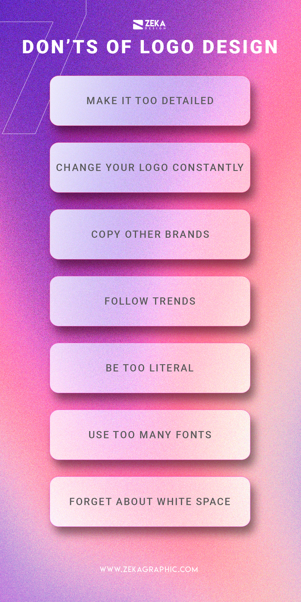
4. Don’t: Use Too Many Fonts

Using multiple fonts in a logo can create visual chaos and make it difficult to read and understand. Stick to one or two fonts that complement each other and align with the brand’s personality. Consistency in typography will help maintain a cohesive and professional look.

5. Do: Opt for Scalability
Image

A logo should be versatile and scalable to ensure it looks great across various mediums and sizes. Whether it’s displayed on a billboard or a business card, the logo should maintain its clarity and legibility. Avoid intricate details that may get lost when scaled down and focus on creating a design that is adaptable.

Summary

Designing a logo requires careful consideration and attention to detail. Here are some key dos and don’ts to keep in mind:

  • Do: Keep it simple and memorable. A cluttered logo can confuse your audience and make it difficult to recognize your brand.
  • Do: Use appropriate colors and fonts that align with your brand’s personality and target audience.
  • Do: Ensure scalability and versatility of your logo design. It should look great across different mediums and sizes.
  • Don’t: Rely too heavily on trends. A trendy logo might quickly become outdated, so aim for a timeless design.
  • Don’t: Overcomplicate your logo with excessive details or intricate graphics. It should be easily recognizable and understandable.
  • Don’t: Forget to consider the context in which your logo will be used. It should be adaptable to various backgrounds and platforms.

By following these dos and avoiding the common don’ts, you can create a logo that effectively represents your brand and resonates wit read more h your target audience. Remember, a well-designed logo is a powerful tool in building brand recognition and establishing a strong visual identity.

Q: What are some common mistakes to avoid when designing a logo?
A: Some common mistakes to avoid when designing a logo include using too many fonts or colors, creating a complex or cluttered design, not considering scalability, and not researching the target audience.
Q: Should I use too many fonts or colors in my logo design?
A: No, using too many fonts or colors can make your logo look unprofessional and confusing. It is recommended to stick to a maximum of two fonts and a limited color palette to maintain a clean and cohesive design.
Q: What should I consider when designing a logo?
A: When designing a logo, it is important to consider factors such as simplicity, scalability, versatility, relevance to the brand, and appeal to the target audience. These elements contribute to creating a successful and effective logo.
Q: Is it necessary to research the target audience before designing a logo?
A: Yes, researching the target audience is crucial in logo design. Understanding the preferences, demographics, and interests of the target audience helps in creating a logo that resonates with them and effectively communicates the brand’s message.
Q: What is scalability in logo design?
A: Scalability refers to the ability of a logo to be resized without losing its visual integrity. A well-designed logo should look equally good and be easily recognizable whether it is displayed on a small business card or a large billboard.

The Power of Typography in Logo Creation

Introduction

Typography plays a crucial role in logo creation. It is not just about selecting a font; it is about understanding the power of typography to convey a brand’s message, evoke emotions, and create a lasting impression. In this blog post, we will explore the significance of typography in logo design and how it can greatly impact a brand’s identity.

1. Importance of Typography in Logo Design

Typography plays a crucial role in logo creation as it helps convey the brand’s personality, values, and message. It is a powerful tool that can evoke emotions, create recognition, and establish a strong visual identity for a company or brand.

2. Choosing the Right Typeface

When selecting a typeface for a logo, it is essential to consider the brand’s identity and target audience. Different typefaces have distinct characteristics that can communicate various emotions and messages. Serif fonts, for example, convey tradition and elegance, while sans-serif fonts are more modern and clean.

2.1 Serif Fonts

Serif fonts, with their decorative strokes at the end of characters, are often associated with tradition, reliability, and sophistication. They are commonly used in luxury brands, law firms, and established institutions.

2.2 Sans-Serif Fonts

Sans-serif fonts, on the other hand, have a clean and modern appearance. They are often used in technology, fashion, and lifestyle brands to convey a sense of simplicity, innovation, and forward-thinking.

2.3 Script Fonts

Script fonts mimic handwriting and are often used in logo designs to add a personal touch or convey elegance and creativity. They are commonly seen in beauty, fashion, and luxury brands.

3. Typography and Brand Personality

The choice of typography in a logo can greatly influence how a brand is perceived. It helps establish the brand’s personality and create a connection with the target audience.

3.1 Bold and Strong

Using bold and strong typefaces can convey a sense of power, confidence, and authority. This is often seen in sports brands, energy drinks, and technology companies.

3.2 Playful and Friendly

For brands targeting a younger audience or aiming to create a friendly and approachable image, playful and rounded typefaces can be used. These fonts evoke a sense of fun, creativity, and informality.

Summary

Typography is an essential element in logo creation as it helps communicate a brand’s personality, values, and overall message. The right choice of fonts can evoke specific emotions and create a strong visual identity for a brand. Whether it’s a bold and modern typeface or a classic and elegant font, typography can set the tone and establish a brand’s unique identity.

Image

Furthermore, typography can enhance the readability and legibility of a logo, ensuring that the brand name or tagline is easily recognizable and memorable. The right combination of fonts can make a logo stand out and leave a lasting impression on the audience.

Typography also plays a crucial role in creating a cohesive brand identity across various platforms and marketing materials. Consistency in font usage helps establish brand recognition and reinforces the brand’s message in the minds of consumers.

In conclusion, typography is a powerful tool in logo creation. It has the ability to convey a brand’s personality, evoke emotions, and create a strong visual identity. By carefully selecting and combining fonts, designers can create logos that are not only visually appealing but also effectively communicate a brand’s message. So, next time you design a logo, remember the power of typography and its impact on creating a m you can look here emorable brand identity.

Logo Design Trends to Keep Your Brand Current

Introduction

Logo design is an essential aspect of branding that can greatly impact how your business is perceived. As design trends evolve, it’s important to stay up-to-date to ensure your logo remains relevant and resonates with your target audience. In this blog post, we will explore some of the latest logo design trends that can help you keep your brand current and visually appealing.

1. Minimalism: Less is More

In today’s fast-paced digital world, simplicity is key. Minimalistic logo designs have gained immense popularity due to their clean and uncluttered appearance. By stripping away unnecessary elements, minimalistic logos create a strong visual impact and ensure easy recognition. Opt for simple shapes, clean lines, and a limited color palette to achieve a timeless and modern logo design.

2. Geometric Shapes: Bold and Striking

Geometric shapes have become a prominent trend in logo design. These shapes, such as squares, triangles, and circles, offer a sense of structure and balance. They convey a message of stability and professionalism, making them ideal for businesses in various industries. Experiment with different combinations and arrangements of geometric shapes to create a visually appealing and memorable logo.

3. Negative Space: Hidden Meanings

Image

Negative space is the area surrounding and between the main elements of a logo. Cleverly incorporating negative space can create hidden meanings and add depth to your logo design. This technique not only makes your logo visually intriguing but also allows for a deeper connection with your audience. Explore how negative space can be used to represent your brand’s values or convey a hidden message.

4. Hand-Drawn Logos: Personal Touch

In an era dominated by digital designs, hand-drawn logos offer a refreshing and unique approach. These logos exude authenticity and a personal touch, making them perfect for brands that want to establish a more intimate connection with their audience. Hand-drawn logos can range from whimsical and playful to elegant and sophisticated, depending on your brand’s personality.

5. Gradient Effects: Vibrant and Eye-Catching

Gradient effects have made a comeback in logo design, adding depth and dimension to flat designs. By blending multiple colors seamlessly, gradients create a visually striking and dynamic logo. Experiment with bold and vibrant color combinations to make your logo stand out and leave a lasting impression on your audience.

6. Responsive Logos: Adaptability is Key

In today’s multi-device world, having a responsive logo is crucial. Responsive logos are designed to adapt and scale seamlessly across different platforms and screen sizes.

Summary

Logo design trends are constantly evolving, and it’s crucial for businesses to adapt to these changes to maintain a modern and relevant brand image. Here are some key logo design trends to consider:

  • Simplification: Minimalistic and clean designs are gaining popularity, as they convey a sense of sophistication and timelessness.
  • Geometric Shapes: Using simple geometric shapes in logo design can create a visually pleasing and easily recognizable brand identity.
  • Typography: Unique and custom typography can add personality to your logo and make it stand out from the competition.
  • Color Gradients: Incorporating color gradients in your logo design can add depth and visual interest, making it more memorable.
  • Responsive Logos: With the rise of mobile devices, designing logos that adapt well to different screen sizes and resolutions is essential.

By incorporating these logo design tren go to website ds into your branding strategy, you can ensure that your logo remains current, visually appealing, and effectively represents your brand identity.

Q: What are logo design trends?
A: Logo design trends refer to the popular styles, techniques, and elements used in creating logos at a particular time.
Q: Why is it important to keep my brand’s logo design current?
A: Keeping your brand’s logo design current helps you stay relevant and appealing to your target audience, and it shows that your brand is up-to-date with the latest design trends.
Q: What are some current logo design trends?
A: Some current logo design trends include minimalism, geometric shapes, gradients, bold typography, negative space, and responsive logos.
Q: How can minimalism be incorporated into logo design?
A: Minimalism in logo design involves simplifying the logo by removing unnecessary details and using clean lines and shapes to convey the brand’s message effectively.
Q: What are responsive logos?
A: Responsive logos are designed to adapt and scale seamlessly across different devices and platforms, ensuring optimal visibility and recognition.
Q: Should I follow logo design trends blindly?
A: While it’s important to stay current, blindly following trends may not always be the best approach. It’s crucial to consider your brand’s identity, target audience, and long-term goals when incorporating design trends into your logo.
Q: How often should I update my logo design?
A: There is no set timeframe for updating a logo design. However, it’s recommended to periodically evaluate your logo’s effectiveness and relevance to determine if an update is necessary.
Q: Can I incorporate multiple logo design trends into my brand’s logo?
A: Yes, it’s possible to combine different design trends in your logo. However, it’s important to maintain a cohesive and balanced design that accurately represents your brand.

Simplicity in Logo Design: Less is Often More

Introduction

Printing has long been associated with negative environmental impacts due to the use of paper, energy consumption, and waste generation. However, in recent years, the printing industry has made significant strides towards sustainability and environmental responsibility. This blog post aims to showcase some inspiring case studies of successful sustainable printing practices, highlighting the positive impact they have had on the environment.

1. Company A: Minimizing Waste through Digital Printing

Company A, a leading printing company, implemented digital printing technology to minimize waste and reduce environmental impact. By adopting this method, they were able to eliminate the need for traditional printing plates, which significantly reduced material waste. Additionally, digital printing allowed for on-demand printing, eliminating the need for excessive inventory and reducing paper waste.

1.1 Results

By implementing digital printing, Company A was able to reduce their paper waste by 40% and decrease their overall carbon emissions by 30%. This not only helped them achieve cost savings but also positioned them as an environmentally responsible organization.

2. Company B: Using Recycled Materials

Image

Company B, a packaging company, focused on using recycled materials for their printing needs. They sourced paper and packaging materials from certified suppliers who adhere to sustainable forestry practices. By using recycled materials, they were able to reduce the demand for virgin resources and minimize the environmental impact associated with paper production.

2.1 Results

Company B’s commitment to using recycled materials resulted in a 20% reduction in their overall carbon footprint. Additionally, their customers appreciated their eco-friendly approach, leading to increased brand loyalty and customer satisfaction.

3. Company C: Energy-Efficient Printing Facilities

Company C, a large-scale printing company, invested in energy-efficient printing facilities to reduce their energy consumption and carbon emissions. They installed energy-efficient equipment, such as LED lighting and high-efficiency printers, which significantly reduced their energy usage.

3.1 Results

By implementing energy-efficient measures, Company C was able to reduce their energy consumption by 25% and lower their carbon emissions by 35%. This not only helped them save on energy costs but also positioned them as an industry leader in.

Summary

In this blog post, we will explore several case studies that demonstrate how printing companies have implemented sustainable practices to reduce their environmental footprint. These success stories will cover various aspects of sustainable printing, including the use of eco-friendly materials, energy-efficient technologies, waste reduction strategies, and responsible recycling methods.

By examining these case studies, readers will gain insights into the innovative approaches and best practices adopted by printing companies to minimize their impact on the enviro check this site out nment. These success stories serve as inspiration for other businesses in the industry to follow suit and contribute to a more sustainable future.

Q: Why is simplicity important in logo design?
A: Simplicity in logo design is important because it allows for easy recognition and memorability. A simple logo is more versatile and can be easily scaled down or reproduced in different mediums.
Q: How does simplicity contribute to a logo’s effectiveness?
A: A simple logo is more likely to grab attention and be easily understood by viewers. It helps in conveying the intended message or brand identity quickly and effectively.
Q: What are the benefits of using minimalistic elements in a logo?
A: Minimalistic elements in a logo help in creating a clean and uncluttered design. They enhance the visual impact and make the logo more timeless and enduring.
Q: Can a simple logo still be unique and memorable?
A: Absolutely! A simple logo can be unique and memorable through clever use of typography, negative space, or a distinctive color palette. It’s all about finding the right balance and creating a design that stands out.
Q: Are there any disadvantages to using complex designs in logos?
A: Complex logo designs can be overwhelming and difficult to comprehend. They may lose impact when scaled down or reproduced in smaller sizes. Moreover, complex logos can also be challenging to remember and may not leave a lasting impression.

Logo Colors and Their Psychological Impact on Branding

Introduction

When it comes to branding, the colors used in a logo play a crucial role in shaping the perception and emotional response of consumers. Colors have the power to evoke certain emotions, convey specific messages, and create a lasting impression. Understanding the psychological impact of logo colors is essential for businesses to effectively communicate their brand identity and connect with their target audience.

The Power of Color

Colors have the power to evoke emotions, influence moods, and shape perceptions. They can communicate messages and create associations in the minds of consumers. Therefore, selecting the right colors for a logo is crucial for effective branding.

Red: Passion and Energy

Red is a color that symbolizes passion, energy, and excitement. It grabs attention and stimulates the senses. Brands that use red in their logos often want to convey a sense of urgency, power, and boldness. Examples of brands that utilize red in their logos include Coca-Cola and Netflix.

Blue: Trust and Dependability

Blue is a color that represents trust, dependability, and reliability. It is often associated with professionalism and competence. Brands that use blue in their logos aim to establish a sense of credibility and security. Examples of brands that incorporate blue in their logos include Facebook and IBM.

Yellow: Optimism and Happiness

Yellow is a color that symbolizes optimism, happiness, and warmth. It is often used to create a sense of positivity and cheerfulness. Brands that use yellow in their logos want to evoke feelings of joy and energy. Examples of brands that feature yellow in their logos include McDonald’s and Snapchat.

Green: Growth and Nature

Image

Green is a color that represents growth, nature, and harmony. It is often associated with eco-friendliness and sustainability. Brands that use green in their logos aim to convey a sense of freshness and environmental consciousness. Examples of brands that incorporate green in their logos include Starbucks and Whole Foods.

Purple: Creativity and Luxury

Purple is a color that symbolizes creativity, luxury, and royalty.

Summary

In the world of branding, logo colors hold immense significance as they influence consumer perception and behavior. Each color has its own psychological impact, triggering specific emotions and associations. For example, red is often associated with passion, energy, and urgency, while blue conveys trust, reliability, and professionalism. Yellow is known for its optimism and creativity, while green symbolizes growth, harmony, and nature. Black represents sophistication and luxury, while white signifies purity and simplicity.

By strategically selecting logo colors that align with their brand values and target audience, businesses can effectively communicate their message and create a strong brand identity. It is important to consider the cultural and contextual implications of colors as well, as different cultures may interpret colors differently.

Ultimately, the choice of logo colors should be based on a thorough understanding of the brand’s personality, target market, and desired emotional response. A well-designed logo with carefu click to read lly chosen colors can leave a lasting impact on consumers, helping businesses stand out in a competitive market and build a strong brand presence.

Q: What is the significance of logo colors in branding?
A: Logo colors play a crucial role in branding as they evoke specific emotions and perceptions associated with a brand.
Q: How do different colors impact brand perception?
A: Different colors have different psychological effects. For example, red signifies energy and passion, while blue represents trust and reliability.
Q: What emotions are associated with warm colors?
A: Warm colors like red, orange, and yellow evoke emotions such as excitement, enthusiasm, and optimism.
Q: What emotions are associated with cool colors?
A: Cool colors like blue, green, and purple evoke emotions such as calmness, tranquility, and creativity.
Q: Can logo colors influence purchasing decisions?
A: Yes, logo colors can influence purchasing decisions as they can create a sense of trust, attract attention, and convey the brand’s personality.
Q: Should logo colors align with the brand’s message?
A: Yes, logo colors should align with the brand’s message to ensure consistency and reinforce the desired brand image.
Q: How can contrasting colors be used in logos?
A: Contrasting colors can be used to create visual interest, highlight important elements, and make the logo more memorable.
Q: Is it important to consider cultural associations with colors?
A: Yes, it is crucial to consider cultural associations with colors as different cultures may interpret colors differently, impacting the brand’s perception.
Q: Can logo colors be updated or changed over time?
A: Yes, logo colors can be updated or changed over time to adapt to evolving brand strategies, target audience preferences, or to signify a brand transformation.

Logo Design Essentials: From Concept to Final Product

Introduction

Logo design is a crucial aspect of branding for any business or organization. A well-designed logo can effectively communicate the values, personality, and essence of a brand. It serves as a visual representation that helps create a strong and memorable identity in the minds of customers and stakeholders.

In this blog post, we will explore the essential steps involved in the logo design process, from conceptualization to the final product. Whether you are a professional designer or a business owner looking to create a logo for your brand, understanding these fundamentals will help you create a successful and impactful logo.

1. Understanding the Importance of a Logo

A logo is a visual representation of a brand or company. It serves as a powerful tool to communicate the essence of a business and create a lasting impression on the target audience. A well-designed logo can help establish brand identity, build trust, and differentiate a company from its competitors.

2. Research and Concept Development

Before diving into the design process, it is crucial to conduct thorough research. This involves understanding the target audience, competitors, and industry trends. By gathering this information, designers can develop a concept that aligns with the brand’s values and resonates with the intended audience.

2.1 Target Audience Analysis

Identifying the target audience is essential for creating a logo that appeals to the right people. Consider factors such as age, gender, interests, and preferences to ensure the design effectively communicates with the intended audience.

2.2 Competitor Analysis

Studying competitors’ logos helps identify design trends, common elements, and unique approaches. This analysis allows designers to create a logo that stands out from the competition while still fitting within the industry’s visual language.

2.3 Brand Values and Message

Understanding the brand’s values, mission, and message is crucial for developing a concept that accurately represents the company. The logo should reflect the brand’s personality and evoke the desired emotions in the target audience.

3. Sketching and Drafting

Once the concept is defined, designers begin sketching and drafting initial ideas. This stage allows for experimentation and exploration of various design elements, typography, and visual styles. Sketching helps visualize concepts and refine ideas before moving on to digital design.

4. Digital Design and Execution

After finalizing the sketches, designers move on to the digital design phase. Using professional design software, they create a digital version of the logo, refining the details and ensuring scalability across different mediums and sizes.

4.1 Typography and Font Selection

The choice of typography plays a significant role in logo design. It should align with the brand’s personality and be legible across.

Summary

Image

Logo design is a creative process that requires careful planning and execution. To create a logo that truly represents your brand, it is important to follow a systematic approach. Here is a summary of the essential steps involved in logo design:

  1. Understanding the brand: Before starting the design process, it is crucial to have a deep understanding of the brand’s values, target audience, and overall identity.
  2. Research and inspiration: Conduct thorough research on the industry, competitors, and current design trends. Gather inspiration from various sources to fuel your creativity.
  3. Conceptualization: Brainstorm and sketch multiple logo concepts based on the insights gained from the research. Explore different ideas and variations.
  4. Digital design: Once you have finalized a concept, bring it to life using digital design tools. Experiment with colors, typography, and visual elements to create a visually appealing logo.
  5. Feedback and refinement: Seek feedback from stakeholders and make necessary revisions to improve the logo. Iterate until you achieve the desired result.
  6. Finalization and delivery: Once the logo design is approved, prepare the final files in various formats and sizes for different applications.

By foll Going Here owing these essential steps, you can create a logo that effectively represents your brand and leaves a lasting impression on your target audience.

Q: What is logo design?
A: Logo design is the process of creating a visual representation that represents a brand or company.
Q: Why is logo design important?
A: Logo design is important as it helps in creating brand recognition, establishing credibility, and differentiating a business from its competitors.
Q: What are the key elements of a logo design?
A: The key elements of a logo design include typography, color palette, imagery or symbols, and overall composition.
Q: How do you come up with logo design concepts?
A: Logo design concepts are usually developed by researching the brand, understanding its values and target audience, and brainstorming creative ideas.
Q: What software can be used for logo design?
A: Popular software for logo design includes Adobe Illustrator, CorelDRAW, and Sketch.
Q: What file formats are commonly used for final logo designs?
A: Commonly used file formats for final logo designs are vector formats such as .ai, .eps, and .pdf, as they allow for scalability without loss of quality.
Q: How important is simplicity in logo design?
A: Simplicity is crucial in logo design as it helps in creating a memorable and versatile logo that can be easily recognized and reproduced across different mediums.
Q: What is the role of color in logo design?
A: Color plays a significant role in logo design as it evokes emotions, communicates brand personality, and helps in creating visual impact.
Q: How can a logo design be made timeless?
A: To make a logo design timeless, it should avoid trendy elements, focus on simplicity, and have a strong concept that can withstand changing design trends.
Q: What is the importance of feedback and revisions in logo design?
A: Feedback and revisions are essential in logo design as they help in refining the concept, ensuring client satisfaction, and achieving the desired final product.

</dl

Crafting a Logo that Speaks: Tips for Successful Logo Design

Introduction

Creating a logo that effectively communicates your brand’s identity and values is crucial for establishing a strong visual presence in today’s competitive market. A well-designed logo can leave a lasting impression on your target audience and help differentiate your business from competitors. In this blog post, we will explore some essential tips and considerations for crafting a logo that speaks volumes about your brand.

1. Understanding the Importance of a Logo

A logo is the visual representation of a brand or company. It serves as a powerful tool to communicate the essence, values, and personality of a business. A well-crafted logo can leave a lasting impression on customers and help differentiate a brand from its competitors.

2. Researching Your Target Audience

Before diving into the logo design process, it is crucial to understand your target audience. Conduct thorough research to identify their preferences, demographics, and interests. This knowledge will guide your design choices and ensure that your logo resonates with the intended audience.

3. Defining Your Brand Identity

Image

A successful logo should reflect the brand’s identity and values. Take the time to define your brand’s personality, mission, and unique selling points. This will help you create a logo that accurately represents your brand and appeals to your target audience.

4. Keeping it Simple

Simplicity is key when it comes to logo design. A cluttered or complex logo can confuse viewers and fail to make a memorable impact. Aim for a clean and minimalistic design that is easily recognizable and scalable across different platforms and sizes.

5. Choosing the Right Colors

Colors play a significant role in logo design as they evoke emotions and convey messages. Select colors that align with your brand’s personality and resonate with your target audience. Consider the psychology of colors and their impact on perception when making your color choices.

6. Typography Matters

The choice of typography can greatly influence the overall look and feel of a logo. Select fonts that are legible, appropriate for your brand, and complement the other design elements. Experiment with different font styles to find the perfect balance between uniqueness and readability.

7. Incorporating Meaningful Symbols

Integrating symbols or icons into your logo can add depth and meaning to the design. Choose symbols that are relevant to your brand’s industry or values. However, be cautious not to overcrowd the logo with too many elements, as it may become visually overwhelming.

Summary

Designing a successful logo requires careful thought and consideration. It should be a reflection of your brand’s personality, values, and target audience. By following these tips, you can create a logo that not only looks visually appealing but also effectively communicates your brand’s message:

  • Understand your brand: Before diving into the design process, it’s crucial to have a deep understanding of your brand’s identity, values, and target audience. This knowledge will guide your design choices and ensure that your logo accurately represents your brand.
  • Simplicity is key: A simple and clean logo design tends to be more memorable and versatile. Avoid cluttering your logo with excessive details or complex elements that may distract from its core message.
  • Choose appropriate colors: Colors evoke emotions and can convey specific meanings. Select colors that align with your brand’s personality and resonate with your target audience. Consider the psychological impact of different colors and their associations.
  • Typography matters: The choice of typography can greatly impact the overall look and feel of your logo. Select fonts that are legible, appropriate for your brand’s image, and complement the other design elements.
  • Ensure scalability: Your logo should be easily scalable to different sizes without losing its visual impact. It should look equally impressive on a small business card as well as on a large billboard.
  • Test and gather feedback: Once you have a logo design, test it across various platforms and gather feedback from your target audience try this web-site . This will help you identify any necessary improvements or adjustments to ensure your logo effectively communicates your brand’s message.
Q: What is the importance of a logo?
A: A logo is crucial for a business as it represents its identity and helps in creating brand recognition.
Q: How can I make my logo stand out?
A: To make your logo stand out, ensure it is unique, simple, and memorable. Use appropriate colors and fonts that align with your brand’s personality.
Q: What are some key elements to consider while designing a logo?
A: Key elements to consider include the use of shapes, typography, colors, and symbolism that effectively communicate your brand’s message and values.
Q: Should I hire a professional designer or create a logo myself?
A: It is recommended to hire a professional designer as they possess the expertise and experience to create a high-quality and impactful logo. However, if you have design skills, you can try creating a logo yourself using online logo makers or design software.
Q: How can I ensure my logo is versatile?
A: To ensure versatility, design your logo in vector format so that it can be scaled to any size without losing quality. Additionally, test your logo across different mediums and backgrounds to ensure it remains clear and recognizable.
Q: What role does color play in logo design?
A: Colors evoke emotions and convey messages. Choose colors that align with your brand’s personality and consider the psychological impact they may have on your target audience.
Q: Is it important to research my competitors’ logos?
A: Yes, researching competitors’ logos helps you understand the market trends, identify unique design opportunities, and ensure your logo stands out from the competition.
Q: How can I protect my logo from being copied?
A: To protect your logo, consider trademarking it. Consult with a legal professional to understand the process and requirements for trademark registration in your jurisdiction.