
Creating Color Palettes: Tips for Harmonious Design
Introduction
Color plays a crucial role in design, whether it’s for a website, a logo, or any other visual project. Choosing the right color palette can greatly impact the overall aesthetic and effectiveness of your design. However, creating harmonious color palettes can be a challenging task for many designers. In this blog post, we will explore some valuable tips and techniques to help you create stunning and balanced color palettes that will elevate your design work to the next level.
1. Understanding the Importance of Color Palettes
Color palettes play a crucial role in creating visually appealing and harmonious designs. They help establish the overall mood, evoke emotions, and enhance the user experience. Whether you are designing a website, a logo, or any other visual content, selecting the right color palette is essential for effective communication.
2. Start with a Primary Color
When creating a color palette, it is recommended to start with a primary color. This color will serve as the foundation and set the tone for the entire design. Choose a color that aligns with the message or brand identity you want to convey.
2.1 Using Color Psychology
Consider the psychological impact of colors when selecting your primary color. For example, blue is often associated with trust and reliability, while red can evoke feelings of excitement or urgency. Understanding color psychology can help you create a more impactful design.
3. Explore Color Harmonies
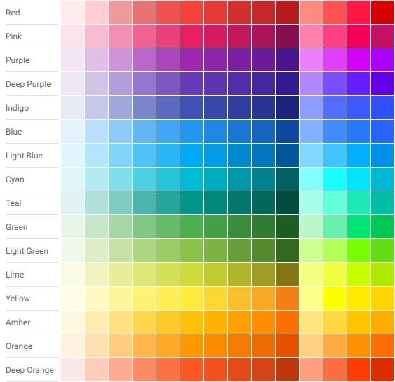
Color harmonies are combinations of colors that work well together. There are various color harmony techniques you can use to create a visually pleasing design:
3.1 Analogous Color Scheme
Analogous color schemes involve selecting colors that are adjacent to each other on the color wheel. This creates a harmonious and cohesive look. For example, using shades of blue and green together can create a calming and natural feel.
3.2 Complementary Color Scheme
Complementary colors are opposite each other on the color wheel. Pairing these colors can create a vibrant and eye-catching design. For instance, combining blue and orange can create a striking contrast.
3.3 Triadic Color Scheme
Triadic color schemes involve selecting three colors that are evenly spaced on the color wheel. This creates a balanced and dynamic design. For example, using red, yellow, and blue together can create a bold and energetic look.
4. Consider Color Contrast
Color contrast is crucial for ensuring readability and accessibility in your design. When selecting colors, make sure there is enough contrast between the background and the text or other elements.
Summary
Creating harmonious color palettes is essential for achieving visually appealing and impactful designs. Here is a summary of the key tips discussed in this blog post:
- Understand Color Theory: Familiarize yourself with the basics of color theory, including the color wheel, primary, secondary, and tertiary colors, as well as concepts like hue, saturation, and value.
- Start with a Base Color: Begin by selecting a base color that represents the mood or message you want to convey. This color will serve as the foundation for your palette.
- Explore Color Harmonies: Experiment with different color harmonies, such as complementary, analogous, triadic, or tetradic, to find combinations that create visual harmony and balance.
- Consider Color Psychology: Understand the psychological effects of different colors and their associations. Use this knowledge to evoke specific emotions or convey desired messages through your design.
- Use Color Tools: Utilize online color tools and resources to generate and refine your color palettes. These tools can provide suggestions, gradients, and even accessibility information to ensure your colors are inclusive.
- Balance Saturation and Contrast: Pay attention to the saturation levels and contrast between colors in your palette. Strive for a balanced mix of vibrant and muted tones to create visual interest and hierarchy.
- Test and Iterate: Always test your color palett find here es in different contexts and lighting conditions to ensure they work well across various mediums. Iterate and make adjustments as needed.
- Q: What is a color palette?
- A: A color palette is a collection of colors that are used together in a design to create a harmonious and visually appealing composition.
- Q: How do I create a color palette?
- A: There are several ways to create a color palette. You can start with a base color and then choose complementary or analogous colors, or you can use color theory principles such as the color wheel to select harmonious colors.
- Q: What is color harmony?
- A: Color harmony refers to the pleasing combination of colors in a design. It is achieved by selecting colors that work well together and create a sense of balance and unity.
- Q: What are complementary colors?
- A: Complementary colors are pairs of colors that are opposite each other on the color wheel. They create a strong contrast and can be used to make elements stand out in a design.
- Q: What are analogous colors?
- A: Analogous colors are colors that are next to each other on the color wheel. They create a harmonious and cohesive look and are often used to create a sense of unity in a design.
- Q: How many colors should I include in a color palette?
- A: It is generally recommended to use around 3-5 colors in a color palette to maintain visual harmony. Using too many colors can make a design look chaotic and overwhelming.
- Q: Can I use color palettes from online resources?
- A: Yes, there are many online resources and tools available that provide pre-made color palettes. These can be a great starting point for your design and can save you time and effort.
- Q: How can I test if my color palette works well together?
- A: You can test your color palette by creating a mockup or a small sample of your design using the chosen colors. Evaluate the overall look and feel, and make adjustments if needed to achieve the desired harmony.

Hello, I’m Luca Cornwall, a passionate and experienced Graphic Designer specializing in various aspects of design, including banner and poster design, web design principles, typography insights, and color theory. With a keen eye for detail and a strong creative vision, I strive to create visually stunning and impactful designs that effectively communicate messages and captivate audiences.