
Navigational Clarity: The Role of Menus in Web Design
Introduction
When it comes to web design, one of the most crucial elements for ensuring a positive user experience is navigational clarity. A well-designed menu can greatly enhance the usability and accessibility of a website, allowing users to easily find the information they are looking for. In this blog post, we will explore the importance of menus in web design and discuss some best practices for creating clear and effective navigation.
The Purpose of Menus
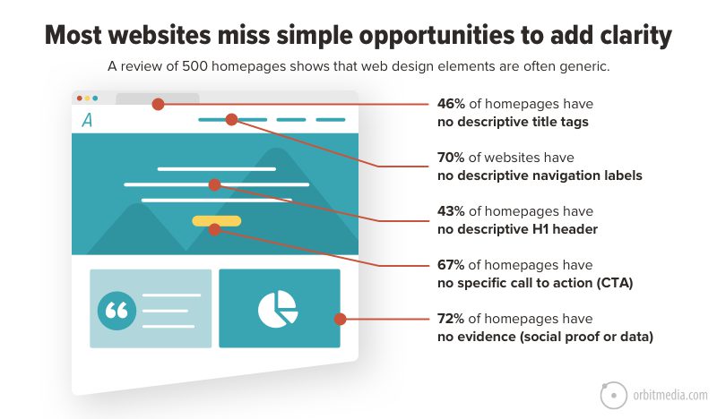
Menus serve as a roadmap for users, guiding them through the various sections and pages of a website. They provide a hierarchical structure that organizes the content and allows users to quickly find what they are looking for. A clear and intuitive menu can significantly improve the user experience, reducing frustration and increasing engagement.
Types of Menus
There are several types of menus commonly used in web design:
1. Horizontal Menus
Horizontal menus are typically placed at the top of a webpage and span horizontally across the screen. They are commonly used for websites with a limited number of main sections or categories.
2. Vertical Menus
Vertical menus are positioned vertically along the side of a webpage. They are ideal for websites with a large number of sections or subcategories, as they allow for easy scrolling and navigation.
3. Drop-Down Menus
Drop-down menus are menus that expand when users hover or click on a specific section. They are useful for websites with multiple subcategories or pages, as they allow for a more compact and organized navigation structure.
4. Mega Menus
Mega menus are large, multi-column menus that display a wide range of options and subcategories. They are commonly used for e-commerce websites or websites with extensive content.
Best Practices for Menu Design
1. Keep it Simple
Simplicity is key when it comes to menu design. Avoid cluttering the menu with too many options or excessive text. Stick to the essential sections and use concise labels that are easy to understand.
Summary
In summary, menus play a vital role in web design by providing users with a clear and intuitive way to navigate through a website. They serve as a roadmap, guiding users to the desired content and helping them make sense of the site’s structure. To ensure navigational clarity, web designers should prioritize simplicity, consistency, and accessibility when designing menus. By following best practices and considering the needs of the target audience, menus can greatly enhance the overall user experience and contribute to t use this link he success of a website.
What is the role of menus in web design?
Menus in web design serve as a navigational tool that helps users easily access different sections or pages of a website. They provide a clear and organized structure, allowing users to find the information they need quickly and efficiently.
Why is navigational clarity important?
Navigational clarity is crucial because it ensures that users can easily understand and navigate through a website. Clear menus help users find what they are looking for, reducing frustration and improving the overall user experience.
How can menus enhance navigational clarity?
Menus can enhance navigational clarity by using clear and concise labels, organizing content logically, and providing intuitive navigation options. They should be easily visible and accessible on every page of the website.
What are some best practices for designing menus?
Some best practices for designing menus include keeping them simple and uncluttered, using familiar and consistent terminology, grouping related items together, and considering the target audience’s preferences and expectations.
Should menus be responsive for mobile devices?
Yes, menus should be responsive for mobile devices. Mobile-friendly menus often use a hamburger icon or a collapsible menu to save space and provide a user-friendly experience on smaller screens.

Hello, I’m Luca Cornwall, a passionate and experienced Graphic Designer specializing in various aspects of design, including banner and poster design, web design principles, typography insights, and color theory. With a keen eye for detail and a strong creative vision, I strive to create visually stunning and impactful designs that effectively communicate messages and captivate audiences.